Skip To Content
Line art star burst

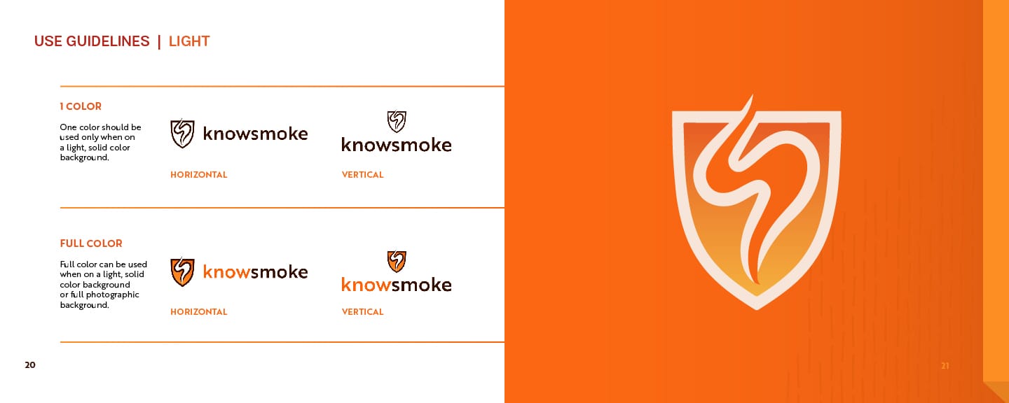
Knowsmoke brand logo in their orange brand color

Knowsmoke

Branding That Sizzles and Smolders

Knowsmoke’s proprietary pilot product tests for cigarette smoke residue in vehicles to protect against the largely unknown dangers of thirdhand smoke. They needed branding guidelines to reflect the cutting-edge technology of their test kit, and we delivered.

Igniting the Brand’s Fire

Knowsmoke approached us with their initial brand elements, including a name, single color choice, logo, and a clear brand vision. However, they needed to further establish and strengthen their brand identity. They wanted a presence that felt scientific but still down-to-earth and human-driven. So, we found a way to portray them as a knowledgable guide that genuinely cares for their customers.

Knowsmoke establishing their brand and identity was crucial as they built up venture capital backing. We formed a solid foundation in using dynamic colors, full-spread images, and impactful text treatments that solidified the brand for efforts moving forward.

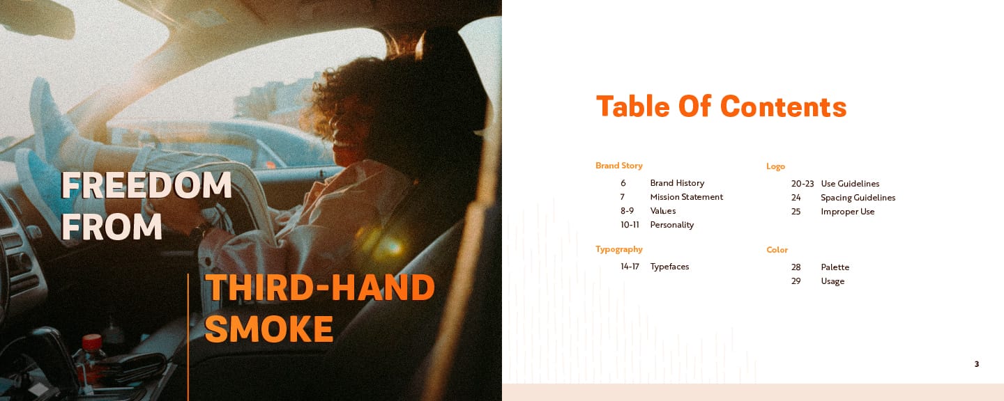
Knowsmoke Brand Guidelines cover image with a man happily smiling with his arms raised out of the car door
Sun with squiggly lines
Blue shape

Describing ‘the look’ you want is one thing. Executing the aesthetic that describes the mood, tone, emotion, etc., we are going for is another.

Nathan Shavers, Co-Founder & CEO
Line art star burst
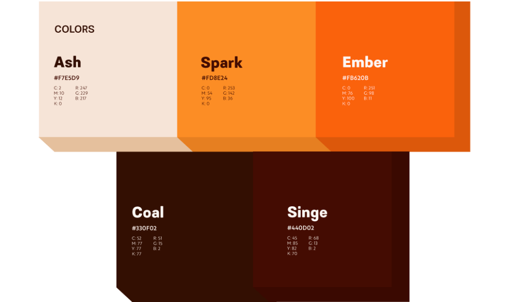
Knowsmoke's color palette of five colors to resemble the colors of a cigarette and smoking

Palette Expansion

With a single orange hue as a jumping-off point, we expanded the palette to include colors that brought more breadth and kept a warmth evocative of an ember (the name of their primary brand color). We chose colors associated with the burning butt of a cigarette, nodding back to the brand’s purpose.

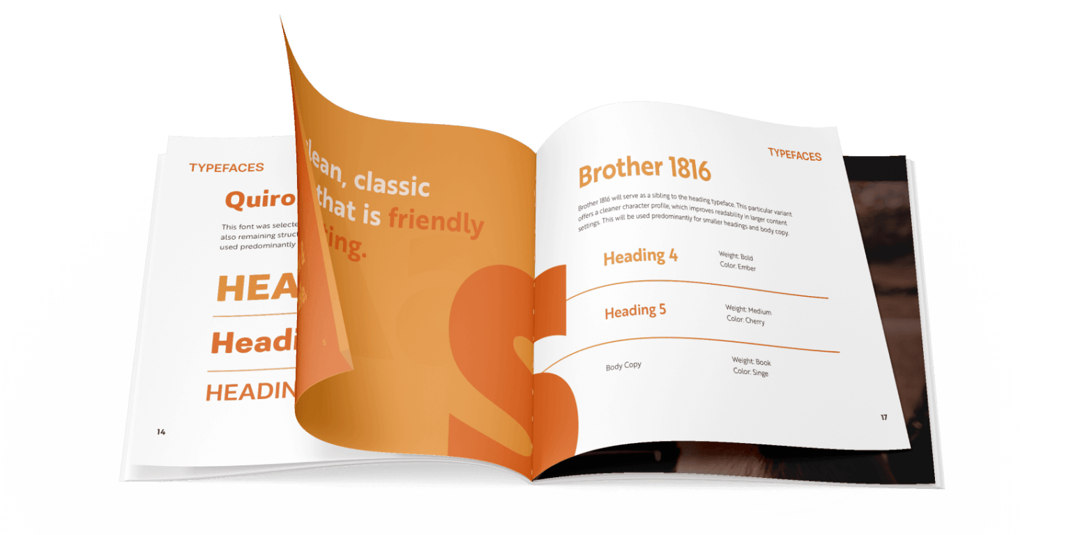
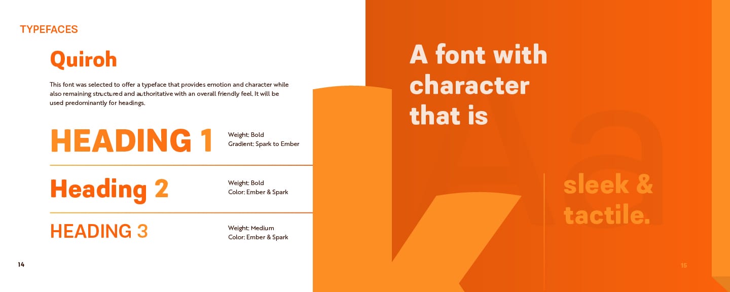
Knowsmoke brand book pages, showing the font options

Fiery Fonts

The font selection was vital in making a strong impact with an emotional, scientific feel. Choosing Quiroh as our primary font, the sans serif character incorporates convex end caps, feeling structured but with a friendlier face due to the subtle, curvilinear forms. 

As our secondary, we chose Brother 1816 due to its clean, classic feel that balanced the roundness of Quiroh. It provided a level of structured sharpness that helped reinforce this serious subject matter.

Image Curation

Human-centric imagery was essential in creating this brand, especially with sales hinging off the desire to protect loved ones’ health in vehicles, whether a used car or rental service. It charges the spreads with a relatable emotion necessary to make a deeper connection.

Multiple photos of passengers in or around a car for Knowsmoke's brand book

Melding a Friendly & Insightful Voice

We defined a personality true to Knowsmoke — a well-balanced presence that’s optimistic, friendly but also scientific and honest about what can be a difficult and unknown subject matter.

This was key in establishing themselves as an authority on the topic but also not alienating their customers through pompous or jargon language.

With a carefully struck balance, the brand speaks from a place of knowledge and keeps language accessible for anyone who may not have any prior experience with their product space.

A Brand Ready For Takeoff 

With a solid brand established, the sky’s the limit for where Knowsmoke can go. Establishing its brand as both professional and refined while still having a core value of caring deeply about human health and wellness is relayed in its content and reinforced in visual representation.

Keep the Fire Burning
Perfect Afternoon rebrand | Office photo with digital marketing icon logo

Website Rebuild for a Digital Agency

Perfect Afternoon

Website Rebuild for a Sustainable Epoxy Company

Entropy Resins

Website Rebuild for a Merchant Processing System

ThirdPhase Processors

Monstera leaves illustration outline for Perfect Afternoon