
Why Simplicity Makes For Good UX
Sometimes in design, a feeling tells us more is better. ‘More’ can be considered additional choices, features, information, and whatever else to pack into a layout. We, as designers, feel like we’re giving the user everything they could need at the tip of their fingers. Loading up a page with every type of information that someone can need may feel like an easy way to inform your user, but more often than not, this ends in confusion – and a not-so-good UX.
It’s often harder to design something simple and to the point that manages to appear still elegant and engaging. Of course, Apple comes to mind when considering a company that does this. Their page’s simple designs are clean and to the point, with much of the superfluous information being nested to keep the layout tidy. This creates an immersive experience to heighten awareness of their products for each page, forcing the user to focus on what Apple wants them to do while also alluding to the luxurious nature of the brand.
This clear focal point on these pages is that simplicity can bring about good UX. Of course, you can still use extraneous design elements, but it must be done aptly and tactfully. If your users can’t see through the flashy effects, excessive content, or densely packed layouts, they won’t see through to the purpose and value you are ultimately trying to convey.
With a simple design, you put your main content and user goals first, giving necessary supporting information and contextual imagery that enhances, not overwhelms.
A Clear Goal Vs. A Myriad
This exact layout styling can be seen when comparing luxury and fast fashion brands; we chose Gucci and SHEIN for this example. This simplicity with Gucci is from the desired perception of luxury goods exclusivity. Their line doesn’t tend to have a surplus of products. In comparison, SHEIN has an extreme amount of stock and features quite a bit of overwhelming information to try and push traffic somewhere relevant. The browsing experiences are starkly different. Where the luxury brand is enjoyable and makes you want to take a moment to appreciate other parts of the site, the fast fashion brand inundates the user with many options giving an immediate sense of overwhelm and uncertainty about where the next step to shop should be.
Gucci
When landing on the Gucci site, you are shown a large slider below the banner that features only one product at a time. The clean, simple layout allows the user to focus on the styling details and craft put into the product. The site as a whole takes this approach, using prominent feature highlights to guide the user to products and collections they want them to see.
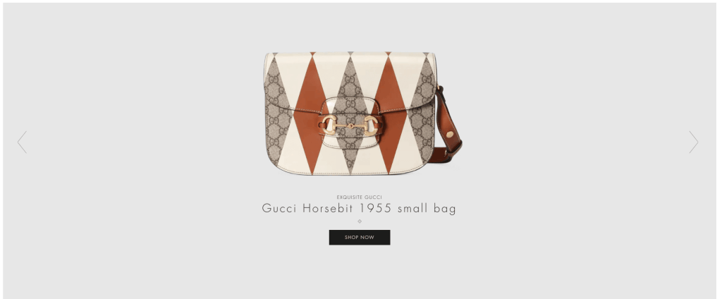
This gives the site such a luxury feel – the simplicity of it all. It allows the product’s design to speak for itself, rather than the site’s design overshadowing the product and the reason a user is here in the first place. This makes Gucci a top-tier example of good UX.
SHEIN
On the flip side, when you go to a fast fashion site like SHEIN, you can see that Gucci decides to display one detailed product photo in the same area. You have a packed grid of product categories, a pop-up, and more packed in areas of content. Immediately you start to feel a sense of decision overload unless you know you came to this site for a specific product. The sheer volume of clickable options immediately bogs down the exploratory nature of UX.
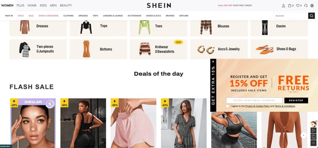
While the brand must display this information on the homepage, a more image-centric and simplistic layout would likely serve much better to get people interested in what they’re looking at, rather than small thumbnails that just help to busy up the space. This would allow the user to take their time a bit more and not be done with upwards of 15 clickable options in one view in the viewport.
Hick’s Law
Hick’s Law is a compelling design principle that speaks to this decision fatigue that occurs when so many choices are presented. It essentially states that the more options someone has, the longer it takes to decide. When there are too many options, a decision might not be made due to exhaustion.
Applying this to websites can take product options on a single product page, the number of navigational items on your site, and listings of plans or services that contain many similar offerings but slight differences. This can be too much for some users, and while trying to make a decision, they end up getting too tired and deciding to finish later or abandon their effort altogether.
How To Evaluate (And Improve) Your UX
Ask Your Users
We can be slightly biased (the royal we, the designers, marketers, and developers constructing the site). We pour a little bit of our soul into our work, feeling so proud of how something may look that we lose the objectivity it takes to step back and critique our work and usability properly. So there is no better way to understand how your site works than to ask the people using it directly. This is where the concept of user testing, surveys, and other UX modalities comes into play. These methods allow users to be candid in their experiences, share pain points and offer general opinions about the design you may have never considered.
Test and Track
Using a site tracking tool like CrazyEgg to monitor and record users can give immense insight into how people use your site. It will highlight obstacles and show common user paths you may not have considered. With CrazyEgg, you can also engage with A/B testing that gives immediate feedback on varying bits of copy and color allocations by serving up different versions to different users and then evaluating which had better performance.
Pulling in your Google Analytics data to help contextualize some of this information can help to put it in perspective. Contextual lenses that could be used may be:
- Most popular pages
- User flows
- Seasonal changes in traffic
- And more!
These views further explain why people may be doing things and if most traffic also follows those same paths. It’s up to you to decide if, based on this newfound information, you want to alter these user journeys or offer splits in the directions to partition the audience to another part of the site you noticed some associated interest with. Still, there wasn’t a straightforward way to get there on the page.
Good UX Matters More Than You Might Think
Many people associate it with tech jargon regarding UX, but it is one of the driving forces across any industry that deals with people and products. This transcends B2B & B2C sales and apps & websites. Good UX can be found in the design considerations made in the handle of your hairbrush, fitting the crook of your hand just right to make brushing your hair delightful rather than just another bit of maintenance throughout your day. It is omnipresent in our society, whether we know it or not. Good UX often goes unnoticed, while bad UX sticks out like a sore thumb.
In Gucci’s case, someone might not think, “Wow, the layout and pacing of this site enhance my experience,” but on SHEIN, a user is likely to think, “You know, this feels very cluttered and overwhelming. I wish this were easier to look through.”
Simplicity is a background feature that elevates the design and makes users want to spend more time on it. In contrast, fatiguing experiences can often end in an abandoned cart and exhausted user, as we have a finite amount of decision-making bandwidth. Simplicity is the way to achieve that guided experience that allows users to settle in and enjoy what’s in front of them while understanding and finding relevant information.
Talk with us today about how a website with good UX considerations can take your business to the next level!
Photo Credit: Stylish Flatlay