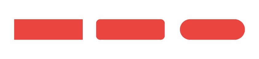
In the early days of the web, buttons were a rectangle and a phrase, or sometimes just an arrow. Now, we see various button styles equipped with extensive hover effects, shapes, and actions. You may even have a personal preference for the button shape you most like.
Identify the Button Shape Right for Your Website
When designing website design comps, I prefer rectangular buttons with rounded corners because of their soft, friendly appearance! But we will explain why picking your button style is much more than just picking what you like.
Subtle associations come from the subconscious relationships we make with shapes. While we commonly see color psychology, shape psychology is also valid and interesting. We associate squares with hardness and sharpness, circles with warmth and comfort, and triangles with movement and wit.
To dig in a little further, you can think about logo design and character and type design when touching on these shape attributes. Take a look at the big three automotive company logos. This gives you some immediate insight into their inner workings and brand positioning. General Motors (GM) appears very serious with its heavy blocks. Even the typography reinforces the angularity with the rectangular underline and strong sans-serif font.
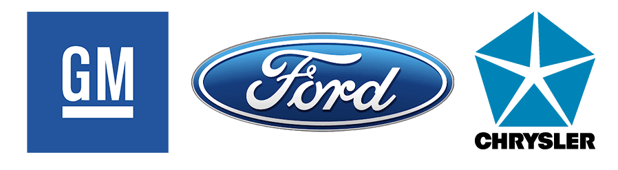
Take a look at the big three automotive company logos. This gives you some immediate insight into their inner workings and brand positioning. General Motors (GM) appears very serious with its heavy blocks; even the typography reinforces the angularity with the rectangular underline and strong sans serif font.
Ford presents a softer feeling by using a fluid script and ovals as the base of its emblem, making it more accessible for some. Chrysler’s original logo, created with 5 triangles, feels like it’s moving your eye through the negative spaces due to the diagonal lines. You can take a look at each of these yourself and assess the emotions the shapes bring about. When you equip yourself with the reasons things seem a certain way, you can make much more informed decisions to feel better for users in the long run.
Express the Brand Stance
Depending on your design, the brand may already call for a certain button style. Say you’re working with a bank. Everything is very stringent and professional. You would want a button style and border radius to reflect this. A sharp, 90-degree angle would be appropriate in this case. A sharp rectangle has a great deal of structure and substance, giving it a very professional look.
However, say you’re working on a new app that’s trying to help people keep track of their time spent on work projects. This is a friendlier, client-facing type of software that users will interact with frequently if it works right. Something like this will often carry rounded corners, which are much friendlier due to their softness.
Even further down this vein of a welcoming brand stance might be a company that deals with childcare booking. This is meant to be incredibly welcoming and warm, so a good way to do this is by incorporating a fully rounded button. The fully-rounded button is peak softness and is enticing to click. It is also a warm, friendly form that subtly encourages this business to do the same with your child.
Keep it Consistent
Depending on your choice, you should ensure the chosen type of border radius, or how rounded the corners on your containers are, is seen throughout your design. Buttons are very important in defining the look and feel of your design. If you have hard, angular containers and images, a rounded edge button will feel slightly out of place. This can be used as an intentional anomaly in the design; the sharp will naturally pop out to viewers in a set of round shapes.
Using a technique like this is a principle in Gestalt Theory called Similarity. The intentional breaking of consistent forms must be done well to feel intentional and not like a mistake. It is important that over an individual button aesthetic, the design meshes with itself and feels connected by various design elements, such as border-radius on containers.
The Nitty-Gritty
Once you pick the shape and style of the button, then comes the time to pick the font, the arrow style, and any hover effects you may want to implement! Arrows should be more closely related to the brand itself. You can venture out and get creative by using objects with a triangular form to imply the arrow, like in one of our projects where we used rocket ships.
This basic shape psychology can be used to inform your arrow choices too. Think about continuing the roundness present in your edges and reflecting that onto the corners of your arrow. Regarding the typography on your button, use something already within the site design that is very readable to ensure clarity.
It is important to take a look at what you are designing, identify your user base, and design it around the feeling you want to evoke for them. While the button may seem somewhat arbitrary, it is fundamental in establishing a consistent look and feel for your site or app’s design. The button is what people are most commonly interacting with when it comes to call-to-actions (CTAs) — we want to make sure it’s not an oversight. It’s easy to make a rectangle, slap some words and an arrow on it, and call it a button, but your user base will appreciate the extra thought put into it.
Contact Us For a Consultation
Do you want to know if your website has the right button shape and links? Contact or call us at 248.582.9210 for a consultation. We can audit your website and present the findings and solutions to improve your online presence.
Featured Image Credit: Envato Elements