
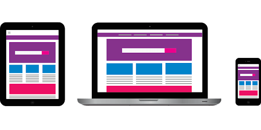
Responsive Design: Changing Norms
The ’90s were simpler for electronics: phones were analog, pagers were commonplace, and you couldn’t talk to your TV remote without looking insane. Nowadays, everything is ‘smart’ and you’re the crazy one for NOT talking to your inanimate electronics. Everything has internet access, and no screen size is the same, from your Smart TV browser to your curvilinear computer monitor and all the different smartphones released year after year. All of these devices have a different aspect ratio.
Kind of a weird concept? Yeah, we know.
With all these different users accessing your website from different devices, the actual layout is almost never just a normal desktop anymore. Most users are using a mobile device now — 64%, actually! Since phones are so readily accessible, this number has risen over the years and is expected to continue its ascent.
Now we understand the change that’s happening in the industry, we need to be reactive. We don’t want to see a website showing up at 2000px wide on a 300px screen – there will be a lot of horizontal scrolling and improper rendering on effects. You may have noticed this if you visited an old site on your phone. It just doesn’t work.
But how does it work?
We must be aware of all the possibilities we may be dealing with. This is called responsive design. If you’re unfamiliar with web jargon, think of responsive design as a response to the viewport of a site shrinking. Things respond and rearrange themselves programmatically so that you always see the optimal layout for your device. If you are on a desktop right now and shrink the size of the browser, you can see this happen in real time. Ideally, site elements will nest, be hidden under menus, and stack on top of each other as the window gets smaller.
As we design, we constantly consider what will happen on small screens. This also helps determine if a design is viable at all. If design elements are on an extreme angle or perfectly fit into one another, as you would see in print design, they can turn into a huge development undertaking. Media queries define different positions of onscreen objects, depending on the current screen size. They are applied to all the elements, text, images, and shapes. When placement gets hyper-specific, it entails many media queries to be done by the developers. So when there is a clear vision in mind, things move much quicker, and you don’t run into tablet or mobile hang-ups where the design simply doesn’t work.
The designer as a clairvoyant
Anticipating the ease of development to stay within the budget requires great design foresight. If your beautiful, full-width container has text intermingling with the background, don’t anticipate it staying that way! This isn’t to say you can’t be creative with your design; you always want to try to push your design as far as it needs to go. Since the web world has had to adapt to this responsive constraint, you’ll notice increased use of the modular layout and sections working together to create a larger framework.
On the web, modular is often synonymous with a boxy layout, utilizing many rectangles and squares to define spaces for image, text, and shape. Being able to break out of a purely modular layout and retain a smooth responsive design is a valuable skill. People respond to things that are different and memorable. We aim to make every site a unique reflection of the brand so that users can remember their experience with the site and want to return. So remember, always design a few steps ahead!
Share your thoughts
How are you ensuring your design concepts stay a few steps ahead of the trends and competition? If you want questions answered or want to start a Design/UX project, send us a message.
Photo Credit: Envato Elements