Google Logo Set
As our agency organized old design assets anticipating spring cleaning, we came across some gems that inspired nostalgic reflection. Over the internet’s short, quickly evolving lifespan, change became fluid, rapid, and omnipresent. A principal influence in web design is the concurrent logo design trends since a website should reflect its brand mark. A microcosm that speaks clearly to the logo evolution is the development of the Google logo set.
A Design Principle
Details and dimensionality were once at the forefront of the logo form. Ironically, the “futuristic” and hyper-detailed style that once ruled the web now looks dated. The flat logo is now considered contemporary, which could have been designed decades ago with far less technology.
Designers often operate on the straightforward principle: KISS – Keep It Simple, Stupid. The design world has embraced this more and more in the modern day. Even Google parted ways with its iconic serifs in favor of a more sleek, clean look.
Google Genesis
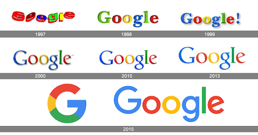
Google’s first logo was akin to Microsoft’s WordArt, which reflected the technology available back then. In 1999, Google locked down its color distribution pattern: blue, red, yellow, blue, green, and red. Since then, there’s been a steady increase in the simplicity of their logo. The font got thinner, and the letters’ drop shadow and dimensional modeling were removed. The type fully flattened in 2013. Naturally, the Google logo set for their ancillary apps, like Google Chrome and Gmail, followed suit.
Google Chrome
The original Google Chrome logo resembled a three-dimensional mechanism from a spaceship. The spacing between the red, green, and yellow implied a moving mechanism that spun away from the blue center, giving the logo a strong focal point and sense of motion. Google came out of the gate strong with an impactful mark that proved hard to forget and was far more visually interesting than the icons of competing browsers at the time.
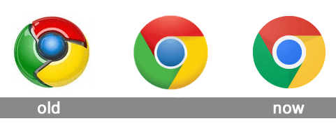
The dramatic highlights and shadows faded away as time went on. In the second iteration, the icon lost its three-dimensional aspect entirely. The loose spacing between the logo components tightened, which created a crisp, near-symmetrical circle. The highlights in the most recent icon and the shape-wide dimensional shadow are incredibly subtle.
Today, there’s a further exploration of form flattening; shadows are so minimal and subtle that it’s almost undetectable. Chrome’s logo can now be easily reproduced for other platforms, and it’s clearly seen on smaller applications, such as their app icons. This became a must in recent years since smartphones and tablets became regular members of the internet browsing community.
Gmail
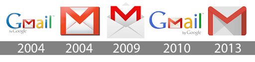
Gmail utilized highly-detailed logos until 2013 when there was a dramatic shift to a simple, vector-based logo. In the long-form 2004 version, nearly every element had a dimensional rendering distracting the eye; the drop shadow and the left aligned “by Google” text, especially.
The 2013 update added softness to the corners of the logo, which made it more inviting and accessible than both the 2004 and 2009 iterations. The simplicity and versatility of the 2013 logo created a much more utilitarian mark than its predecessors because it lacks complex components. The new logo can be easily animated and used in smaller sizes.
Interesting, Right?
As a graphic designer, it’s imperative to notice how logomarks, like the Google logo set, evolve to reflect the businesses they represent; they show how design continues to ebb and flow. The design world is in the midst of the Renaissance of the vector, and designers will continue to observe and appreciate the constant fluctuation of aesthetic preference until we reach the next era of design. PA’s (formerly known as TM) creative team uses this knowledge to implement these trends for our clients to help them stand out from competitors.
Contact us with questions about this blog post, graphic design, or starting a new project. We’d love to help!
Banner Photo Credit: Envato Elements